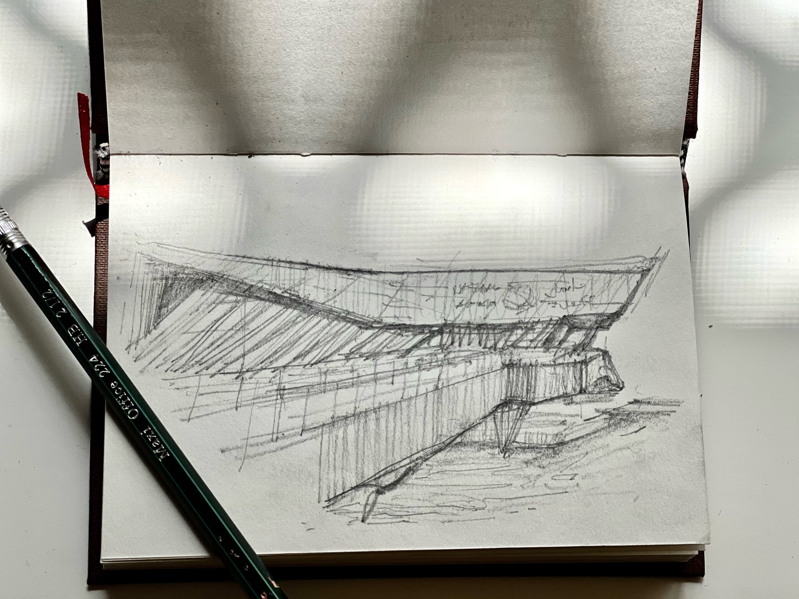
SKETCHING ON LOCATION (1st time)

1st Sketch: This is where I erased the most and took the longest to complete. The placement of my subject on paper was too high; so I have to make up for it by adding ripples of water to the negative space. At first I attempted to make an architectural sketch – defining every element of the building; but then realized, it was not feasible. I figured depth is better defined by fully shading areas with the most intense shadows or materials of lower hue value; this technique can be seen in the succeeding sketches.

2nd sketch became easier to do, since I have a better understanding on what type of composition works. The form of the building is easier since the subject is only comprised of straight lines. The perspective of the bridge makes the composition more interesting. However, the struggle here was that I was sketching standing. Holding the sketchbook with my left hand (while standing) makes some of my lines, a bit shaky; this is evident in the sketch above.

3rd sketch: I applied what I’ve learned from the above sketches: I decided that it is better to sit down and to incorporate perspectives. The downside of looking for a sitting spot is you don’t have a lot of options for the view. In here I wasn’t able to see some of the parts of the building covered by the trees. I decided to include them in the drawings and experiment if it will look good or not.


5th sketch: It is better to bring a foldable chair with you because you don’t always have a sitting spot. In this case, I was standing again and haven lesser time than the rest of the sketches. With better understanding of the sense of depth, I made difference variations of shading. The shading on the gate, indicates the color difference of the material to the overall picture.

6th Sketch: I decided to switch it up by using a pen, so shades and shadows will all be in form of hatching. The type of pen that I used in here is not really ideal since its very difficult to adjust the line weight with pressure. It was my mistake as well to incorporate soft shadows from the trees (the hatching on the ground and wall); this just makes the image look crowded. I tried to adjust the presentation of the sketch by making some of the edges thicker and adding random lines, making the “messy” feel of it more of a style and not by mistake.

7th sketch: I tried to control the pressure a bit more. Here I started with straight lines of less pressure then then draw over them with more pressure, adding lineweight. I decided that it is better for objects in the background to to be defined only by their edges. Also here, there is more negative space than the rest of sketches because it makes it more appealing. With my previous sketch, I got lost in counting the wall projections and openings, so in this sketch I made sure not to do that.

Final Sketch: Taking it a step further, I sketched a night scene. I was curious on what techniques I can apply, since the style that I develop relied on depth and shadows; hard shadows casted by the harsh sunlight. Here I decided to use a regular ballpoint pen, as I will have a better control of the lineweight. I hatched most of the sketch to translate into paper, the darkness of the scene: and leave negative spaces for where the light is.
